Pringles
Consumer Packaged Goods
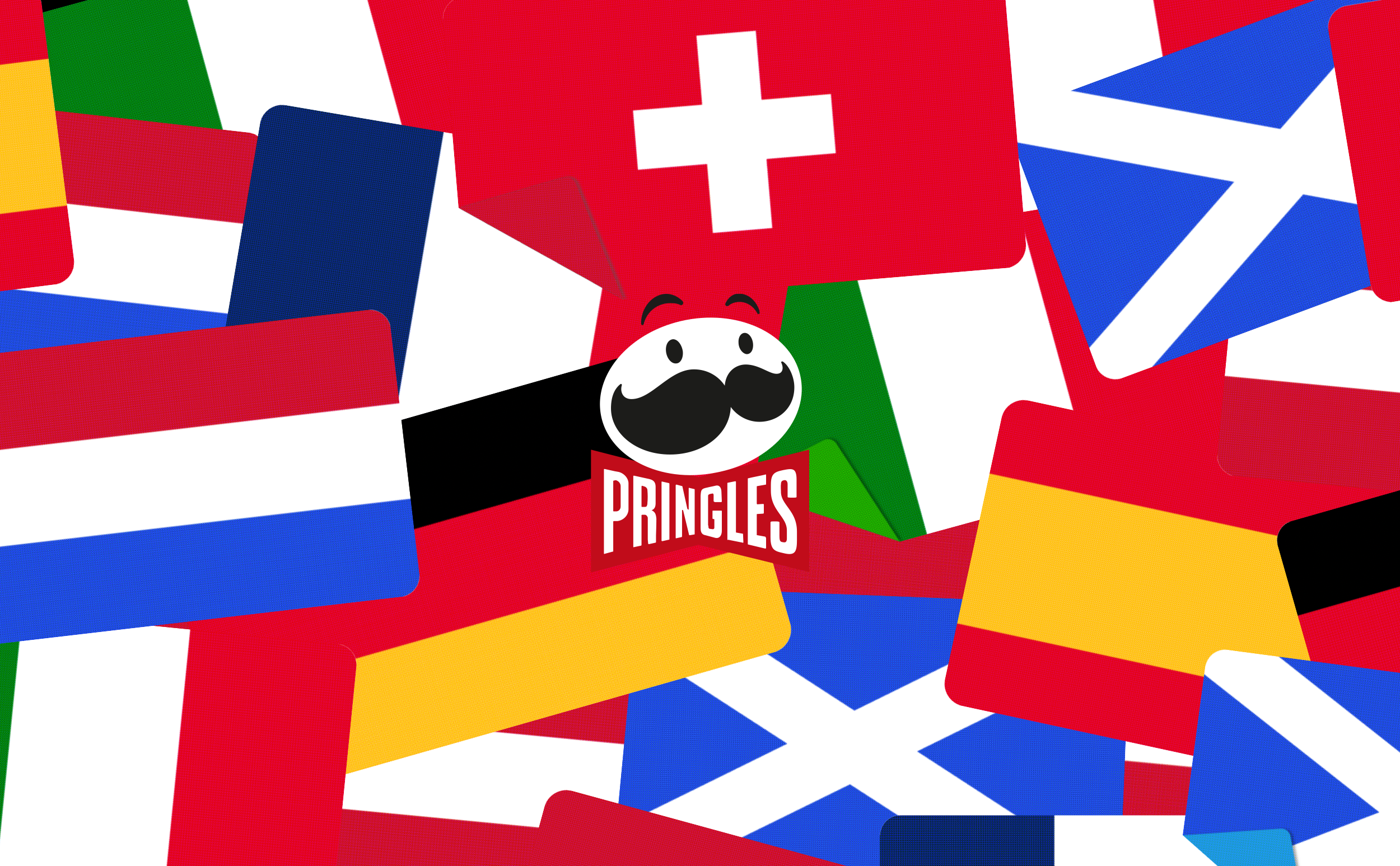
Pringles new promotional packaging wants to bring some flavour at the UEFA Euro 2024.
Introducing a Fanvertising Campaign – with the help of 1,500+ digital billboards across Germany, fans can decide what they want to see. The goal was to develop a crisp and clear design execution to maximize visual impact in 10 seconds, while embodying the brand expression to ensure consistency and distinctiveness.
Let the games—and the snacking—begin!
Type of Work
Advertising Campaign
Year
2024
Role
Design Lead
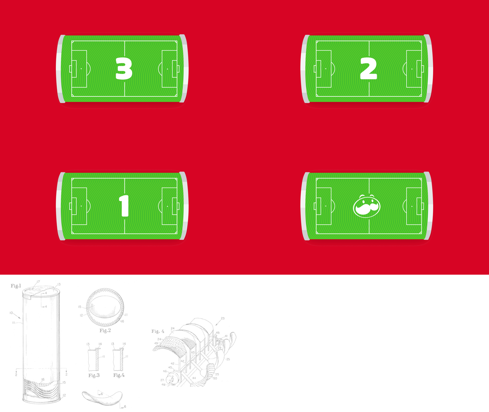

Even though, Pringles is not an official sponsor for UEFA Euro 2024, we couldn’t run away from the opportunity of doing some kicks. Almost as historical as the first game, Pringles packaging filed in 1966 was giving some inspirational flair.
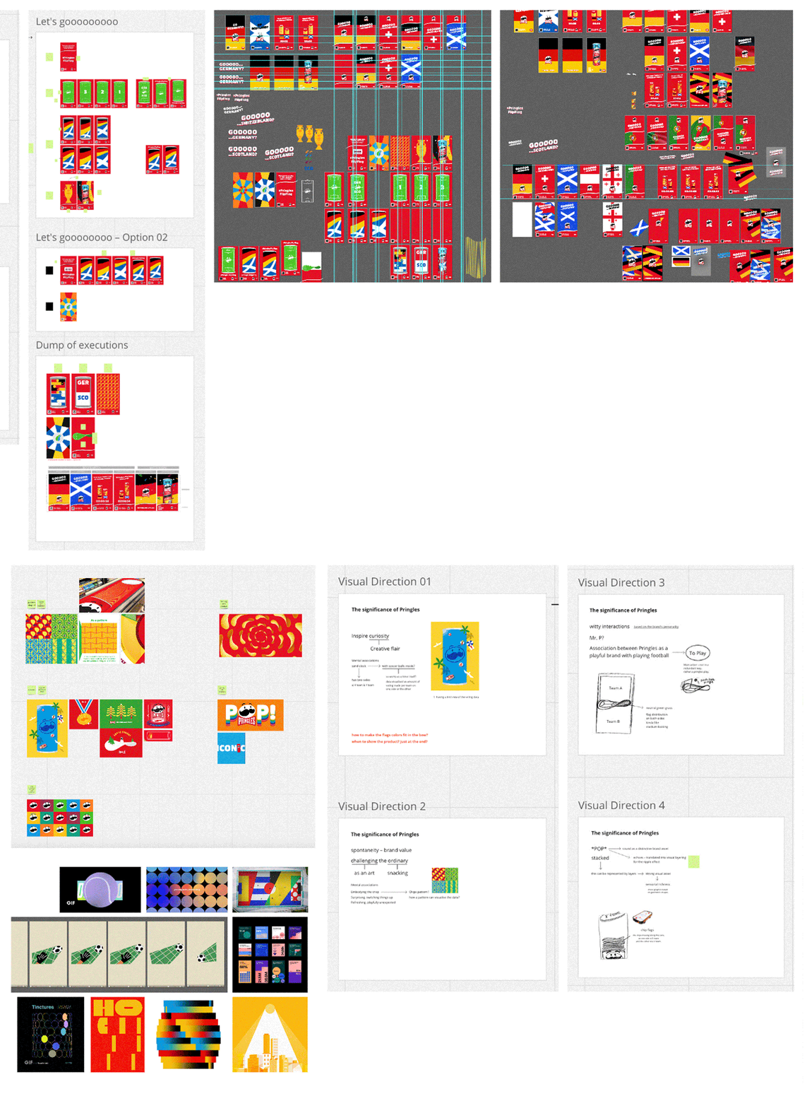
Sneak Peek Process.
The focus of this campaign aims to address three main needs:
1. succinct and engaging campaign message,
2. assets suitable to feel in motion with a kinetic & fun Pringles edge, and
3. interactive mechanic to drive engagement.
... Let’s pick our players!
Iconic Warp Effect.

Core Asset – Flags.

Distinctive Brand Asset – Chips.

The use of bright, happy and on-brand colours are represented throughout the core asset. A rich classic red is used as main colour that stands out, paired up with accent colours to communicate each flag properly while allowing its brandmark to pop.

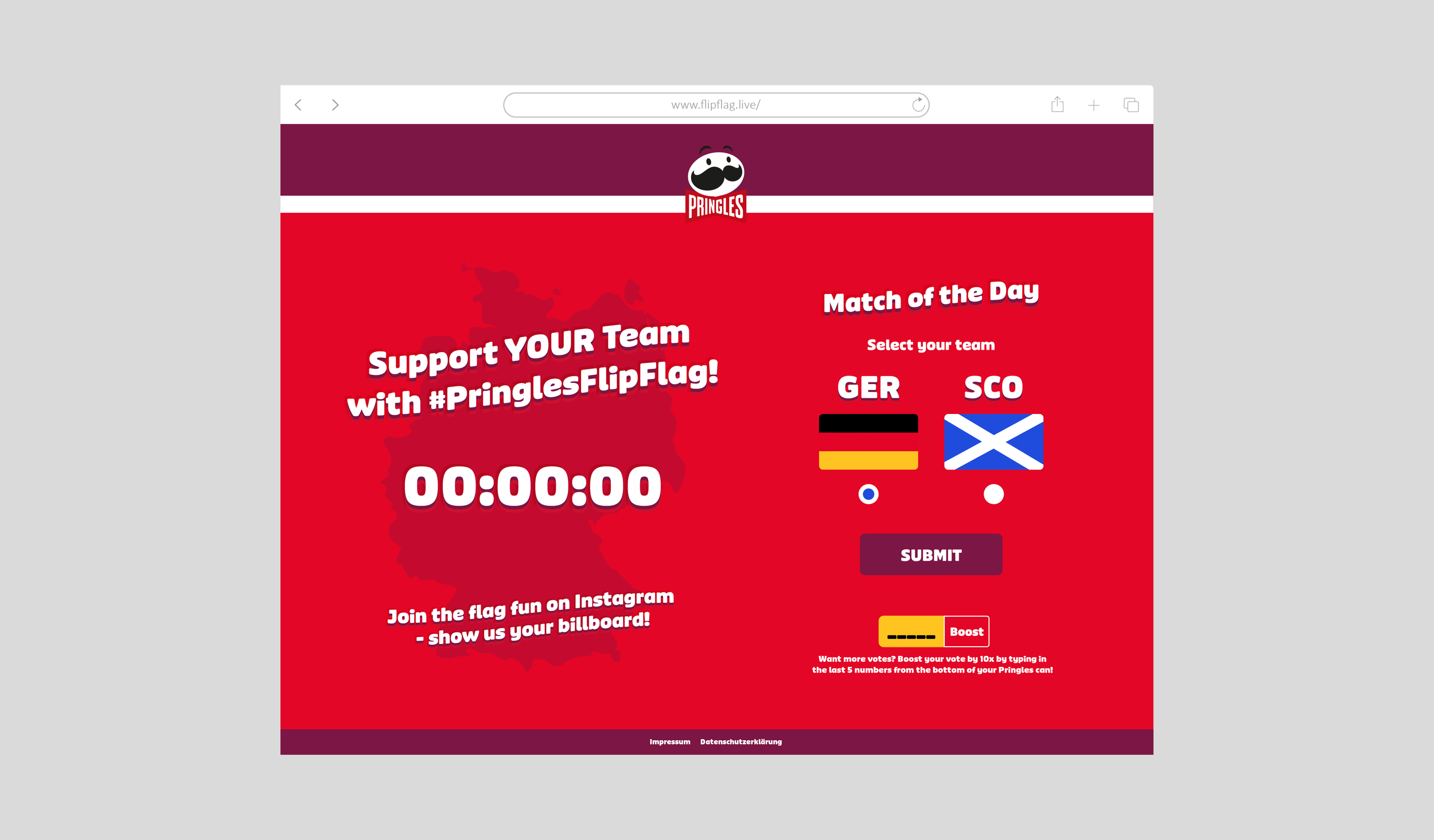
The QR code redirects to the voting site. Keeping it concise. Allowing the billboards take over the playfulness.
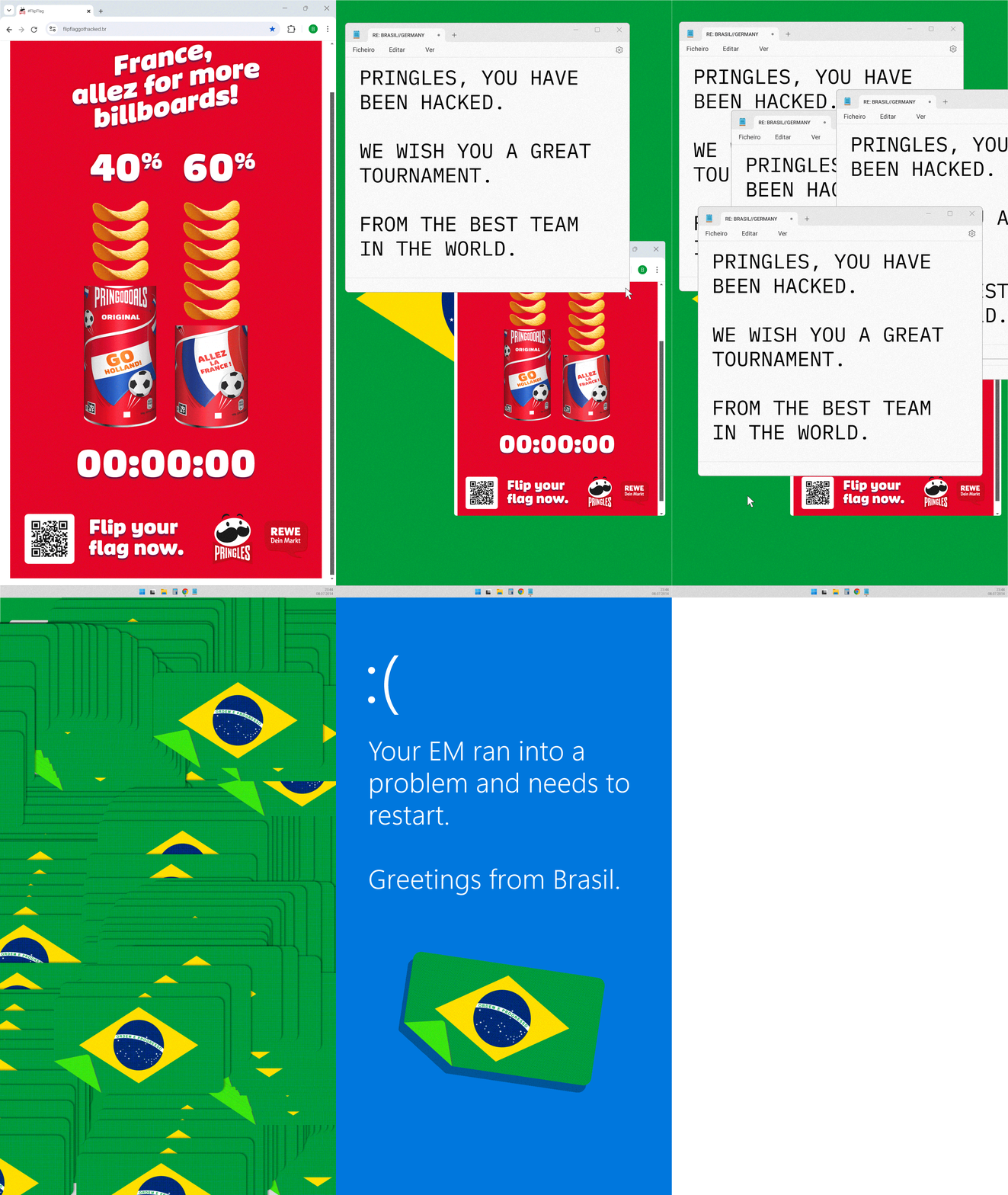
As part of the campaign, there was a planned hack to increase social reach. Just to add the last chip of spontaneity as our brand personality.



Scan the QR code! Then, vote for your team – before the actual football match starts. When the game is live, the most voted team will have billboards with this flag displayed across Germany.

Long-standing Pinup Regular font from Pringles.
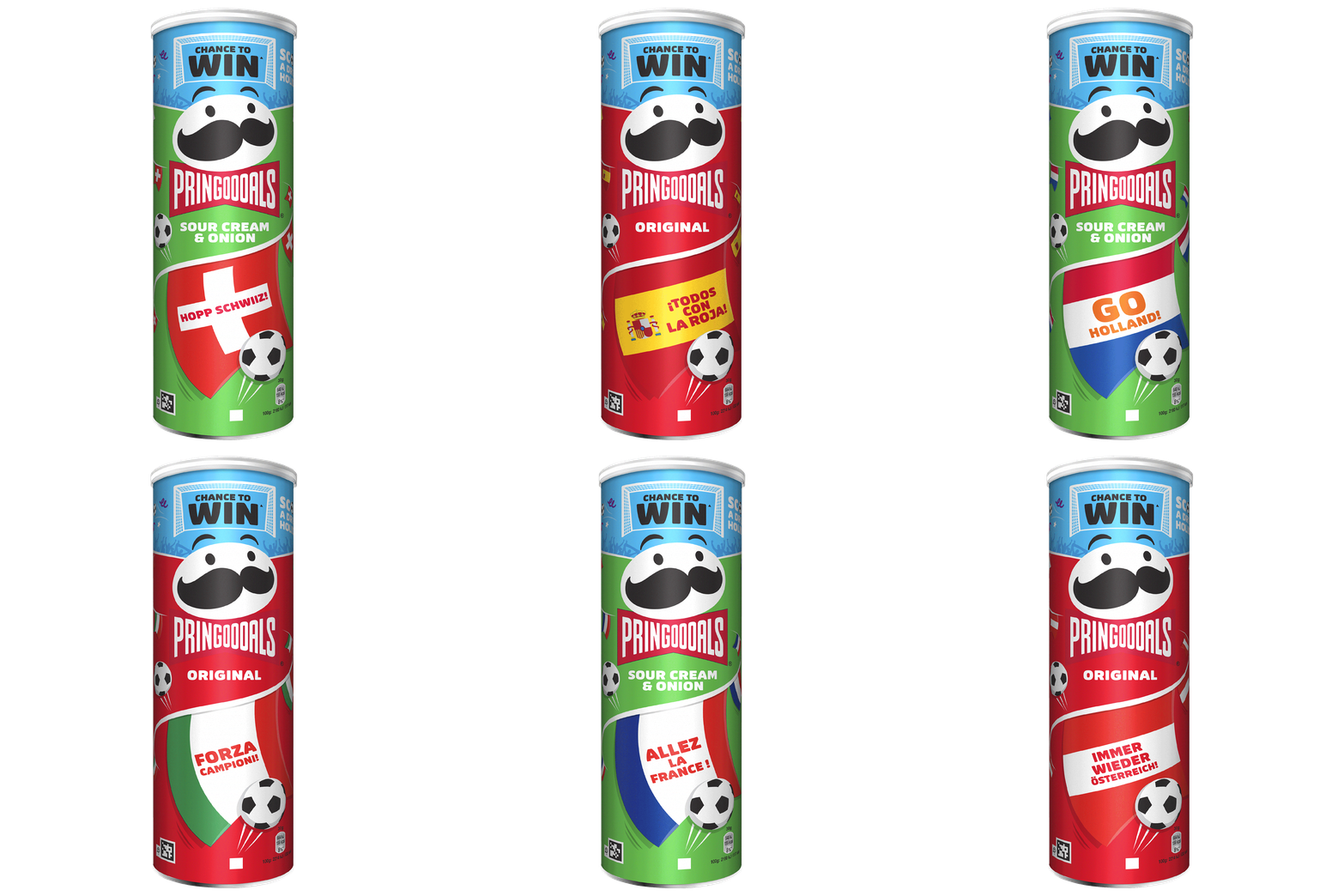
Promotional Packaging in both flavours, original and sour & cream.

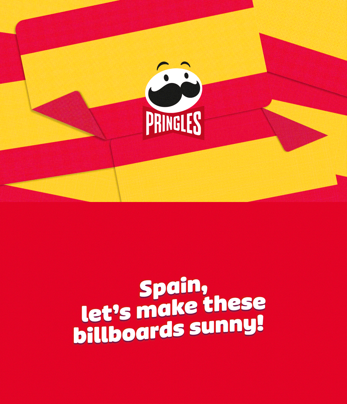
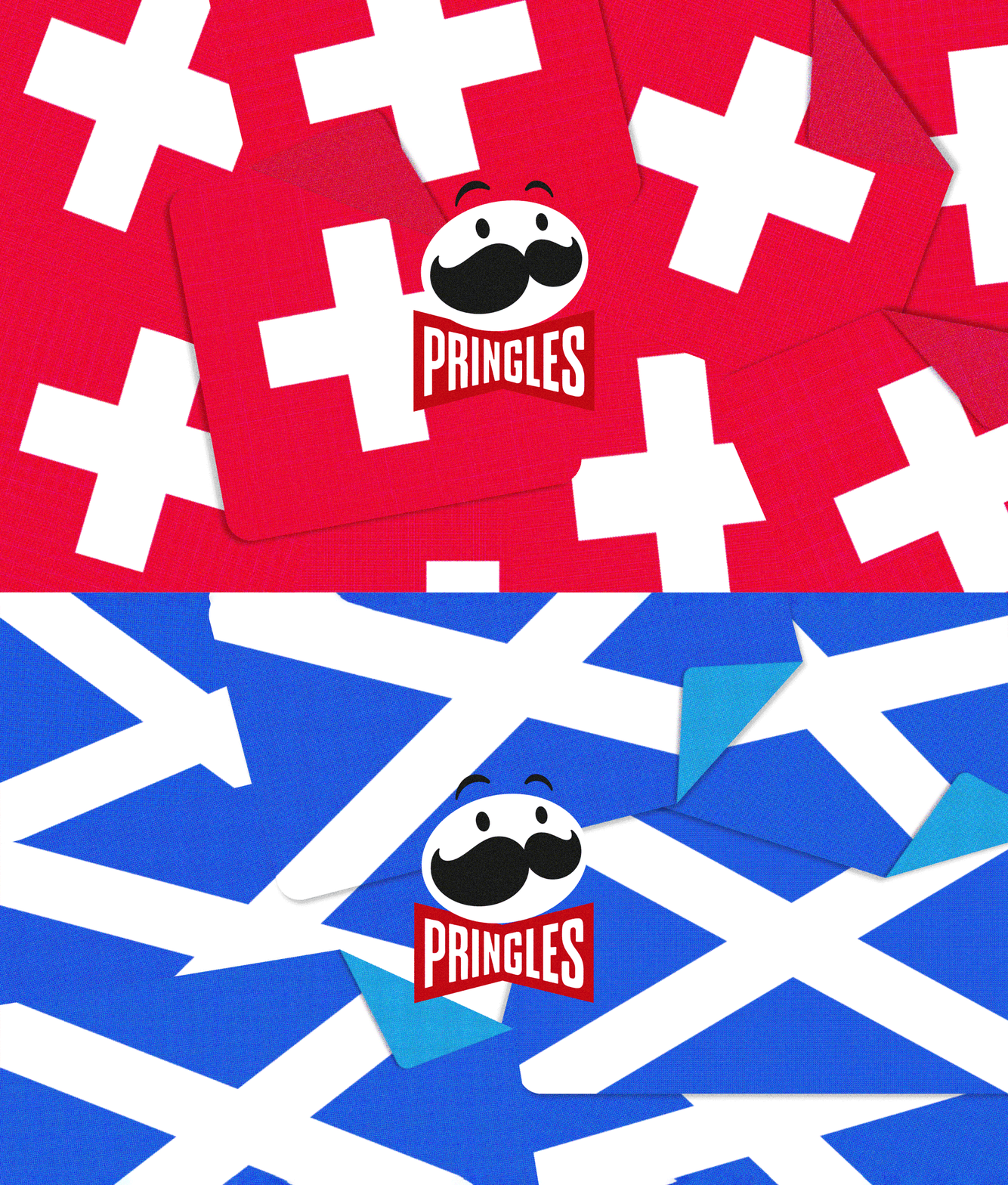
The folded corner creates a bumper sticker feeling. Carrying a first interaction perception.

The warp treatment in typography is used throughout the headlines inspired on the original logo UEFA Euro 60’.


At the end… sharing is caring!
Creative Direction – Reza Ramezani
Design Lead – Mariana Arias
Copywriting – Silvia Zohm, Ines Unterberger
Account Lead – Hernando Torroella
Motion Designer – Alexander Karl
Code Developers – Johan Bove, Rodrigo Bazan